<< back

Frozen Sting

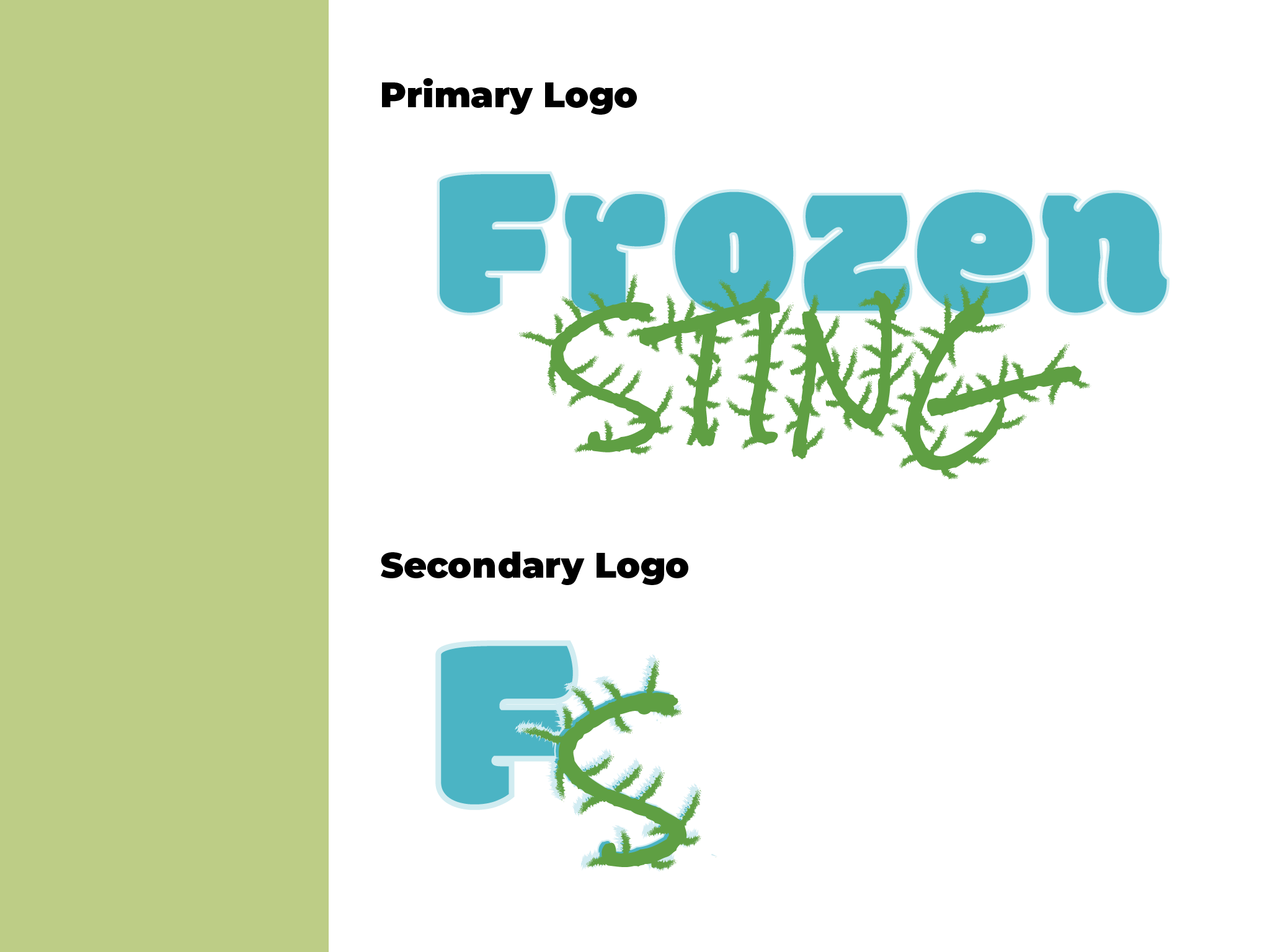
Frozen Sting is a local ice cream truck that caters events and has a love for both ice cream and cactus.

Those two loves are blended to create an inviting brand identity that embodies the playful

Two versions of the brand logo, one more horizontal and one more square using just the "F" and the "S" of "Frozen Sting". The word "Frozen" is thick and rounded, the word "Sting" is jagged with thorns".
Six rectangles in each of the colors for the brand: dark cyan, teal, light sky blue, rich green, pastel green, and off white.
Two patterns developed for use throughout the brand. Both feature cacti. The first goes between green catci and blue cacti inside stout ovals. The second pattern repeats the shape of a cactus made only of thorns and cactus flowers
A guide of the typography used for this brand. Headings are Montserrat Black, subheads are Montserrat Bold Italic, body copy is Fira Sand, and the logo is comprised of Modak and Rock Salt.
A collage of three pieces of printed collateral for Frozen Sting: a menu breaking down the options when ordering ice cream mocked up on a truck wrap, an ice cream cup featuring the primary logo and a pattern along the bottom, and a branded apron.
A mockup of the Frozen Sting Instagram page. The bio reads "Mobile Ice Cream Store, Book us for your next event". Each post is shown flatly just below this mockup
A photo of a community event with event information inside an organic green shape in the bottom right corner. The secondary logo is placed in the top left corner with a blue circle acting as a backdrop for contrast
A vector graphic promoting a sale. "Cinco De Mayo" is written on a papel picado inspired banner. The banner is a flat vector illustration with a cactus on it. The sale information is just underneath the illustration. A pattern runs across the bottom
A photo of an ice cream truck with text overlayed reading "Welcome Summertime! Stay cool as a cactus." The secondary logo is placed in the top left corner.
A photograph of a cactus with pink cactus flowers. Text overlays the image, reading: "Book us! Birthday parties, school events, special occasions, ect.". The secondary logo is placed in the top left corner
A flat vector illustration with the words "Feel the sting: book us for your next special event". The background features a cactus illustration from one of the brand patterns. There is also the name "FROZEN STING" repeating with a low opacity
A photo of a park with event information inside an organic green shape in the bottom right corner. The secondary logo is placed in the top left corner.